With the growth in the use of mobile devices to access the Web, sites today need to be responsive. This means that they need to adjust to the screen size and resolution of the viewing device of the website visitor. Google calls this “smartphone-optimized websites.” According to a recent study of two million unique web visits across various industries by marketing and public relations firm Walker Sands Communications, “23.14% of web site visits in December 2012 came from mobile devices, an 84% increase over December 2011 and a 283% increase over January 2011.”Clearly the trend in mobile web access is growing and having a website that is easy to view on any device will be an advantage.
In addition, Google ranks responsive sites higher than non-responsive.. According to Google, responsive sites (versus having separate mobile and desktop sites) “keep your desktop and mobile content on a single URL, which is easier for your users to interact with, share, and link to and for Google’s algorithms to assign the indexing properties to your content. Google can discover your content more efficiently as we wouldn’t need to crawl a page with the different Googlebot user agents to retrieve and index all the content.” So to maximize search engine optimization, SEO, a responsive site is a must.
If you use Google Analytics, a new section under Audience has been created called Mobile. There you will find two reports: Overview and Devices. Overview shows you the number of visitors from desktop and mobile devices. Here is an example for the KickStart website for January 2013 in which 9% of site traffic was from mobile devices.
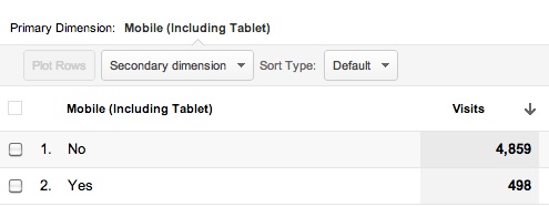
Google Analytics Mobile Overview
The devices report shows you the devices in descending order of use. Of the 9% mobile traffic to the KickStart site in January 2013, not surprisingly 70% was from either the Apple iPad or iPhone.
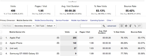
Google Analytics Mobile Devices Report
For an example of a responsive site, check out the recently redesigned KickStart Alliance website. This site is built on WordPress in which there are hundreds if not thousands of themes to choose from, more and more each day are responsive.

Newly-designed KickStart Alliance website – desktop view
And below the mobile view. From the desktop view, simply grab the bottom right corner of the page and shrink to “resize”.

KickStart Alliance website – mobile view
For more information on responsive websites,contact Mary Gospe.